Who lives here: A family of four with a 13-year-old daughter and a 10-year-old son, plus their groodle pooch.
Style of home: A Victorian-era terrace in inner Melbourne, with a light-filled contemporary extension that’s enhanced functionality, and a smart new look throughout.
Timeline: The property was purchased in 2013. Building work started in 2015, and the last piece of furniture was delivered in 2017.
Families change shape as their children grow, which happened predictably a few years ago to the four occupants of this home in Melbourne’s south. “We love the area and have been here for a long time, but we simply outgrew our other house,” says the owner.
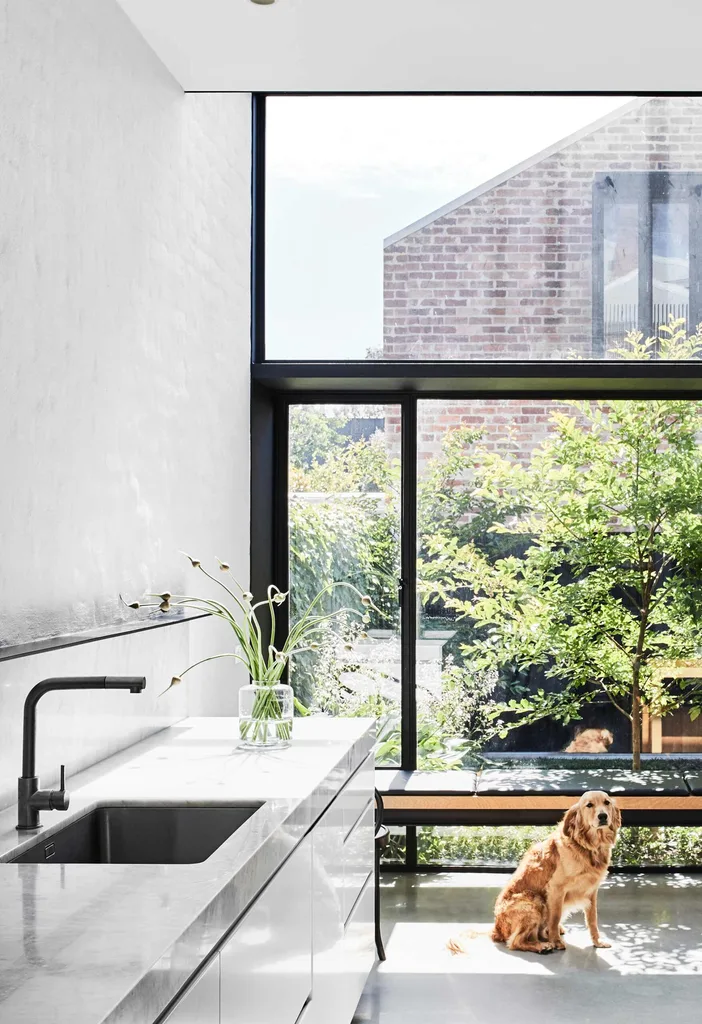
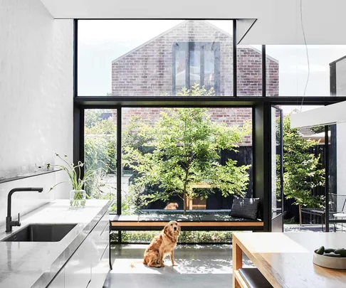
Kitchen This side of the space is light while the opposite wall is the start of the dark cabinetry running the length of the home. Joinery by Nexus Designs, fabricated by Kurv Living. Benchtop, honed Carrara marble. Brushed platinum tapware, Astra Walker.
As luck would have it, a charming terrace house soon became available nearby. Despite the property’s tired state and an outdated 1980s extension with no redeeming features, the remaining heritage elements drew the locals in.
“There was an integrity to the original rooms at the front of the house,” says the owner. The home’s orientation also appealed, as light is obviously critical in a terrace.
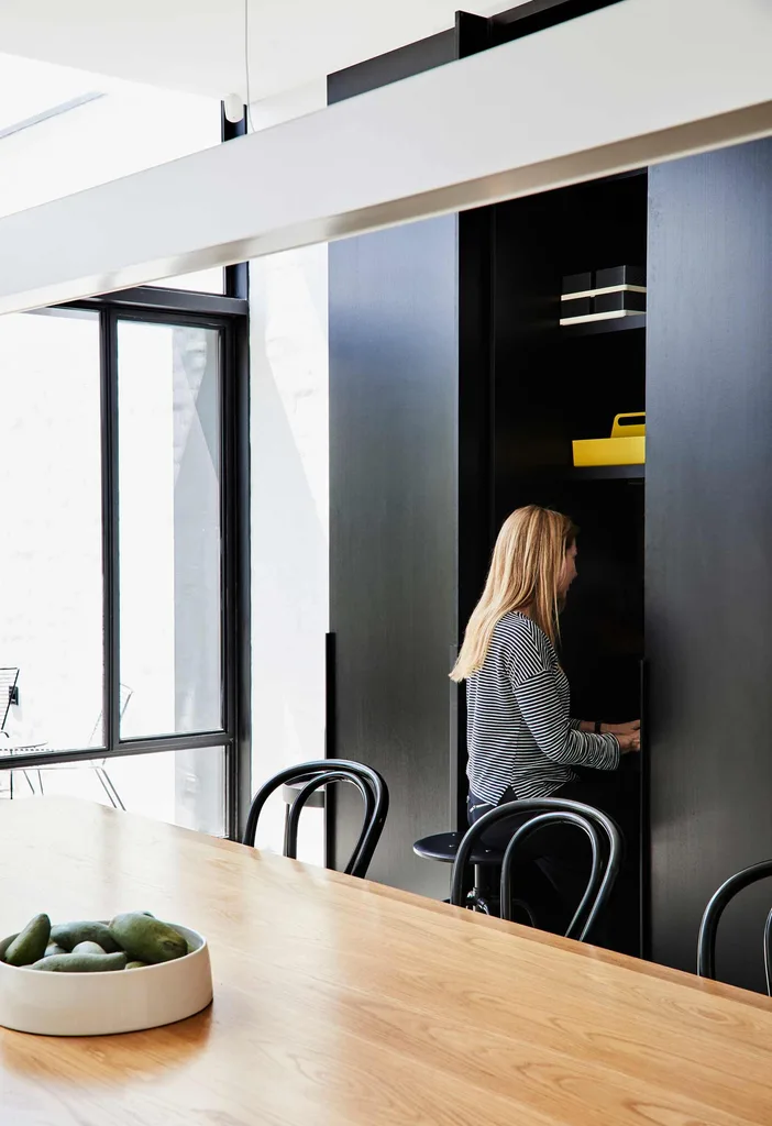
Open-plan Sunlight pours through a wall of floor-to-ceiling glass in the combined kitchen/dining room of this Melbourne home, where eating is far from the only thing that happens. The joinery running along one side of the home opens here to a cleverly concealed study nook, which maximises space without compromising the room’s streamlined aesthetic.
Its rear elevation faced north, so there was definitely potential to open up the back and bring in a lot more natural light.
Emma Mitchell of EMArchitects was asked to design the extension, with a focus on harnessing that light. With the big picture locked in and construction by Matt Ritchie of MR Contracting underway, Sonia Simpfendorfer, from Melbourne-based interior-design firm Nexus Designs, was brought on board to reimagine the interior.
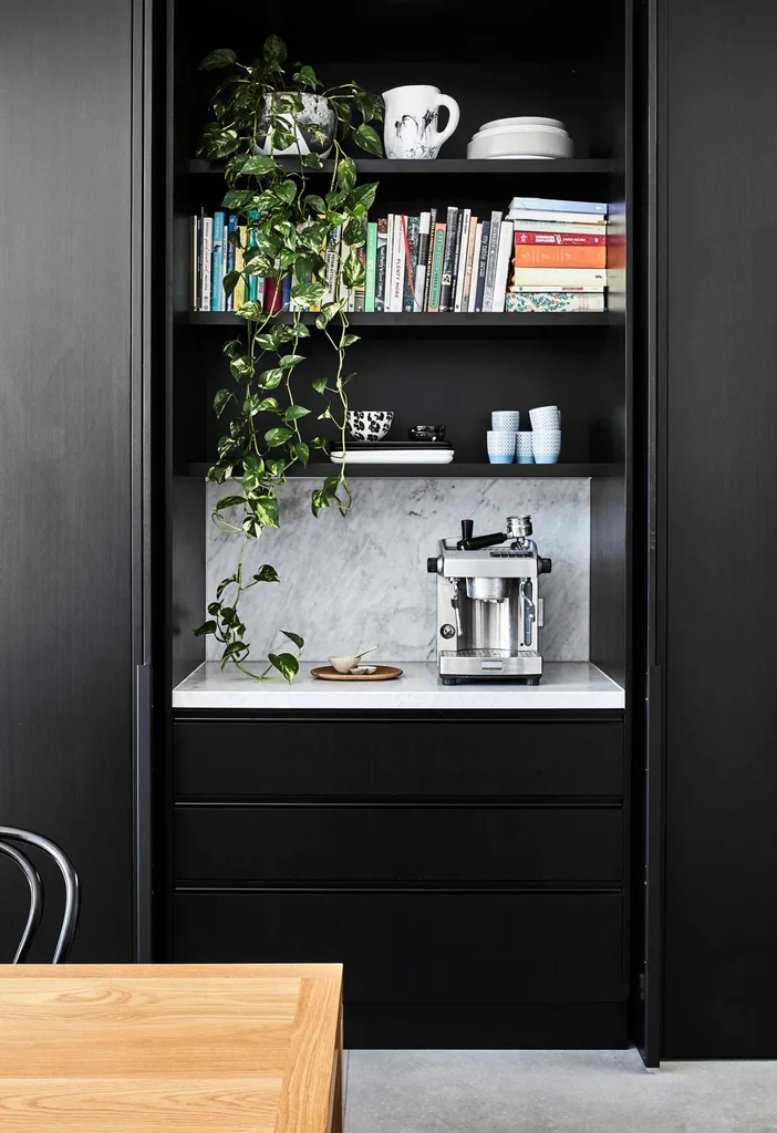
Breakfast bar Opening the 2.7m-high, timber-veneer doors reveals this hidden gem and other great storage spaces, such as a handy appliance unit and a walk-in pantry with soft-closing sliding door.
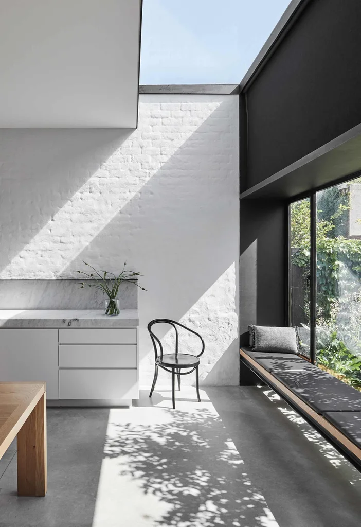
Daybed Above the black leather built-in seat is one of the home’s seamless skylights. The steel window frames were designed by architect Emma Mitchell as an integral part of the building’s structure. Brick wall, painted Dulux Lexicon to match the white cabinetry and work with the concrete floor.
“The clients wanted practicality and functionality – and for it to look fantastic,” Sonia explains. “They knew themselves well and briefed their design team clearly.”
Architect, interior designer and client were united in their vision to honour the property’s original character.
“Good heritage homes have a scale and solidity that is very valuable. The key is to introduce the natural light and functionality that suits how we like to live now,” says Sonia.
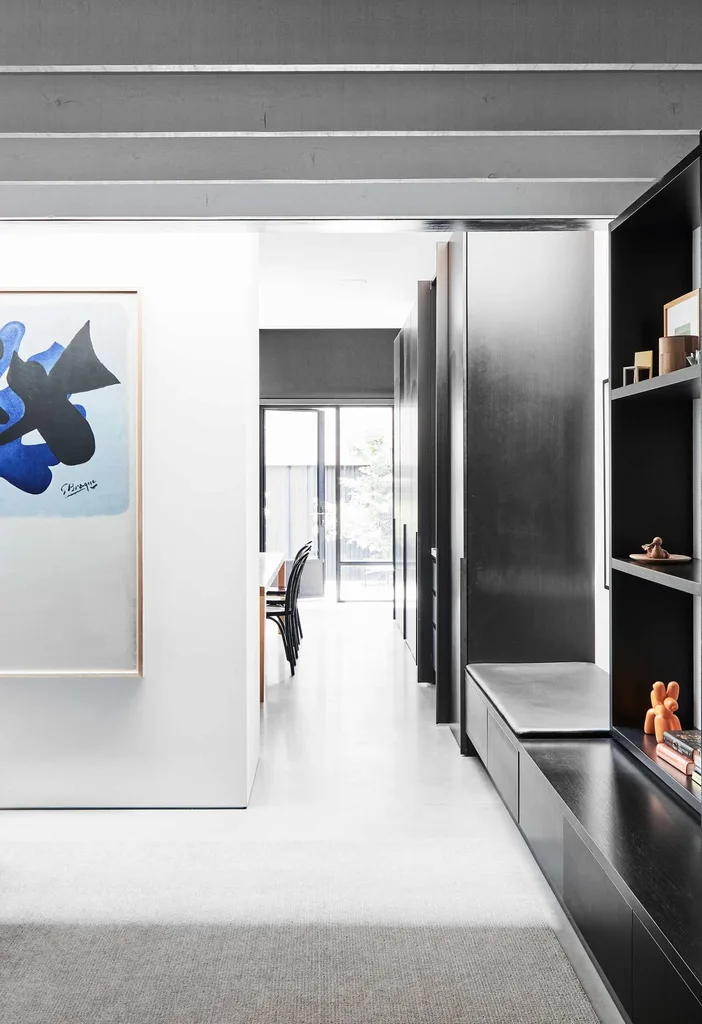
Day bed Above the black leather built-in seat is one of the home’s seamless skylights. The steel window frames were designed by architect Emma Mitchell as an integral part of the building’s structure. Brick wall, painted Dulux Lexicon to match the white cabinetry and work with the concrete floor.
The family prioritised green space, briefing Emma to reduce the building footprint slightly so that more area could be given over to the garden.
To make way for the new open-plan kitchen and dining area at the back, the existing extension was to be demolished. “A higher ceiling in that space would then create a feeling of spaciousness without needing a big footprint,” says Emma.
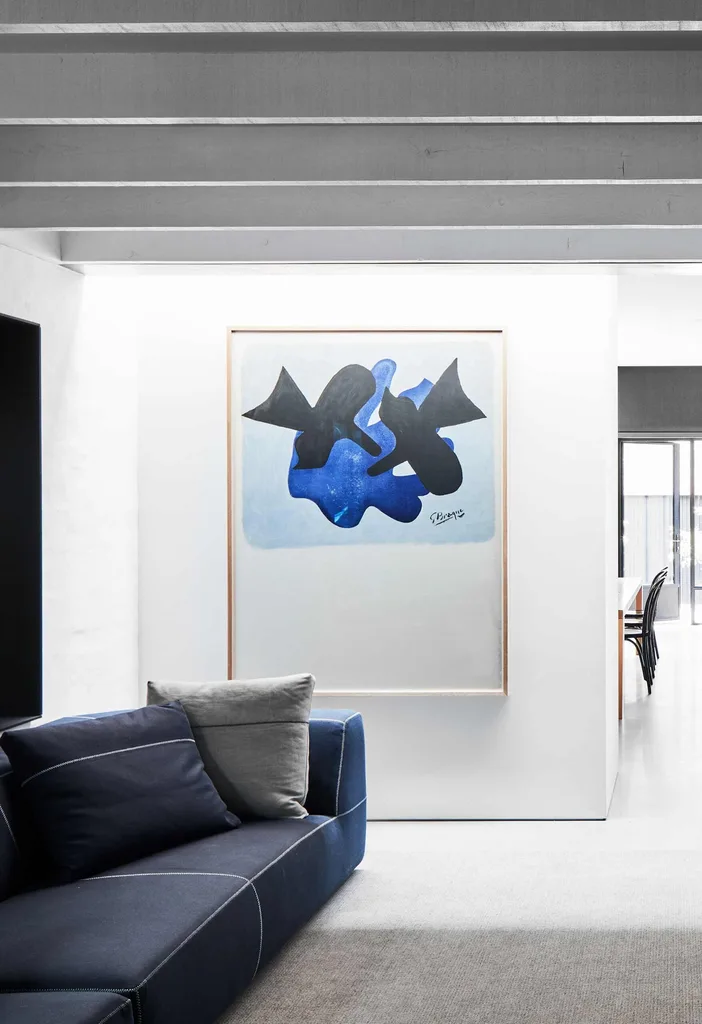
Living Half the room is a corridor, so furniture placement was crucial. The black square at left is a steel window box looking out to a light well. Print by Georges Braque.
Black steel-framed windows were requested from the get-go by the homeowners, who also wanted skylights to bring in as much light as possible. And as is the case for any household with children, maximising storage was a priority.
wishlist
Open kitchen and dining area “With room for lots of guests,” says the homeowner.
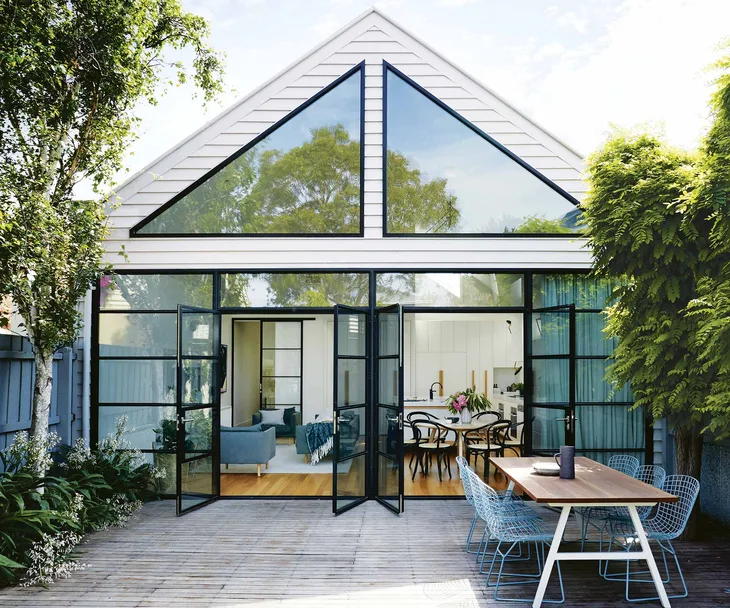
Black steel-framed windows A stylish way to capture light at the back of the house.
Custom joinery For more storage throughout.

Living The rug was custom-coloured by Behruz Studio to match the concrete.
Sonia was asked to give the interior fit-out a fresh, clean look and improved functionality.
“The clients were very clear that they were looking for simplicity – for fewer finishes, not more – and for visual and functional streamlining,” Sonia offers. “They weren’t distracted or tempted by trends or fashion; they just wanted the good stuff!”
The designer says she developed a refined material and colour palette that “walks the line between timeless graphic crispness and the warmth and practicalities necessary for comfortable family living”.
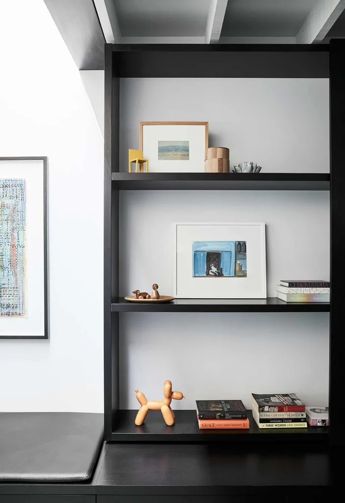
Shelves Light pours onto this semi-internal space and shelving via another well-placed skylight. Balloon dog, IMM Living.
Glimpses of the original brick walls indicate the transition from old to new, providing an enduring backdrop for Sonia’s work. “I like to identify the things that keep the value and beauty of a heritage house while being ruthless about what needs to be changed to make it actually work,” she says.
Neat joinery solutions and clever space planning throughout the home delivered on the clients’ request for optimised storage and an uncluttered look. Sonia also curated furniture and lighting schemes that dovetail beautifully into the updated section as well as the existing rooms.
“The pieces were chosen in response to the scale of the spaces, as well as comfort and sculptural form,” she explains.
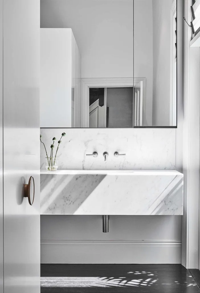
Ensuite Carrara marble also features here and space is maximised by the mirrored cabinet. American oak handles, Kurv Living.
Confidence and a clear vision underpin this striking home’s creation. Its nimble contractors and the homeowners’ sharp decision-making ensured a smooth renovation journey, despite a mid-term layout reshuffle on the second level and a tweak of the joinery design on the ground floor. “The clients were very decisive, which meant the build powered on,” says Sonia.
The outcome is an elegant expression of well-designed simplicity, with an overall feeling of calm. In the renovated spaces, uncomplicated forms are a fitting modern companion to the terrace’s original elements, such as the marble fireplace in the front bedroom and the brick walls.
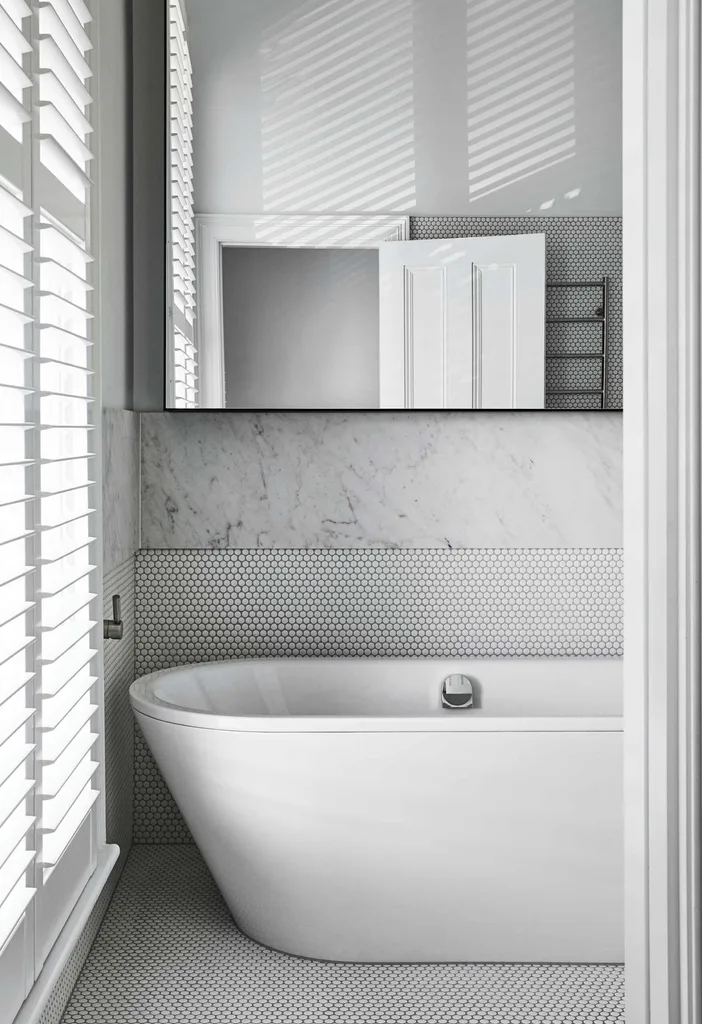
Bathroom Light comes through the shutters and is bounced around the room. Kaldewei ‘Classic Duo’ bath, Bathe. Tapware, Astra Walker. Tiles, classic penny rounds.
Now 12 metres of sleek joinery runs through the living and kitchen areas and hides masses of storage and a study nook, while the north-facing wall of glass framed in black steel overlooks the garden and separate garage with its office space and bathroom above.
Daily life has definitely improved for the owners and their children, and they are excited to see how the home evolves in coming years: “As the children grow, it’s impossible to predict exactly what they’ll need, but we are really happy here now.”
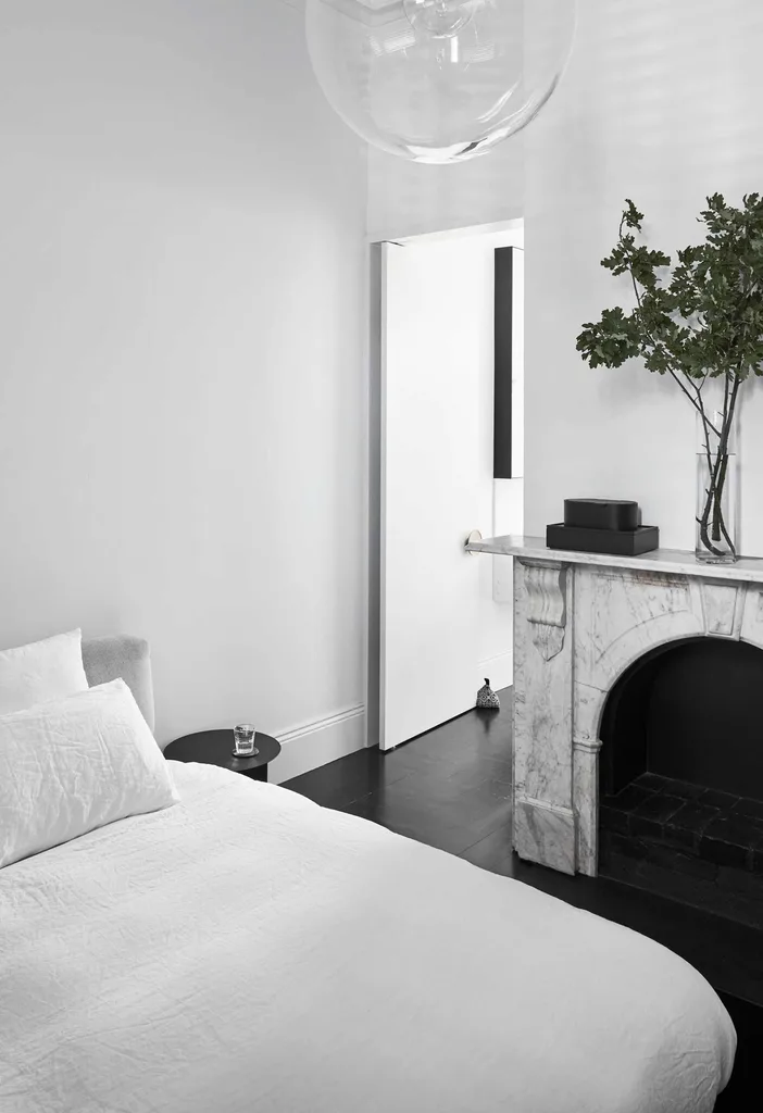
Main bedroom A black Japan finish on the pre-existing floorboards has given this downstairs room a more contemporary look. Original Carrara marble mantel. Selene pendant, Anibou.
the best bits
Larger kitchen “This has allowed us to have a bigger dining table so we can invite more friends over,” says the owner.
Downstairs bathroom “The new design is fabulous. Large and open, it has plenty of storage yet still offers privacy.”
More light “We love the big windows and their views of our garden.”
lessons learnt
“Our clients were unwavering in their desire to keep things simple,” says Sonia. “They wanted a pared-back, timeless feeling so we kept the focus on the modest elegance of the spaces and respected the architect’s sensitivity to the building’s history. Maximising storage and practicality were also key. I like to find new ways to add plentiful storage without making rooms look complicated and this applies to all my projects, in homes of every era.”
See more residential projects by EMArchitects at EMArchitects. Inspired work by Nexus Designs can be viewed at Nexus Designs.

