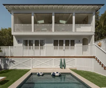
When owners Natalie and Julian Oliver bought their 1920s Californian bungalow in Sydney’s inner-west it had been renovated just a year before.
The renovation ticked some all-important boxes – “we loved the flow,” Natalie says – but in neutral colours and with lashings of timber, it was a tad bland. So interior designers Natalie Manning and Alex Bain, Principals of Property Lipstick were called in to zap up the rooms and make them appear a little bigger.
real living
Writer: Chris Pearson
Photography: Maree Homer

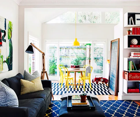
The brief to the Property Lipstick team was to zap up the rooms and make them appear a little bigger. The starting point? A dramatic artwork owned by homeowner Natalie. “The rest of the living room had to work with the artwork above the sofa, with colours and patterns such as the geometric cushions coordinating with it,” says Natalie Manning, who, along with Alex, waved the decorating wand.

The dining table was a revelation for owner Natalie: “After some mourning over my old dining table, the girls convinced me we needed a round table. That was the best decision we made. Round tables are perfect for family dinners, everyone faces each other and it feels so cosy and intimate.”

“The owner loves primary colours, but we didn’t want it to look too explosive,” Natalie Manning says. Brilliant red and yellow are tempered with charcoal rugs and white walls. “The house had to be young and bright, but also soothing and calm, so you can relax there.”

The carefully controlled palette creates unity among collections in floor-to-ceiling shelves in the living room.

Deftly applied, a touch of Lipstick comes to the rescue. Natalie, left, and Alex discuss their handiwork.

“I had always said, when I had my Californian bungalow, it had to have plantation shutters,” says owner Natalie. “So we also added them to all the bedrooms.”

“I usually gravitate towards neutrals and play up texture, but I really like the colour here,” says Natalie Manning. “It feels like a happy home, vibrant and alive, but not too chaotic.”

The generous entry endeared the owner to the house from the get-go.

 Maree Homer


