Who lives here: Sean, CEO of a trades services company, and Franki, a lawyer, together with their three children: Stella, 13, Willow, 11, and Leo, nine; plus Bunny, a cavoodle.
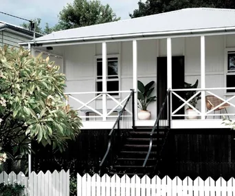
Style of home: A pre-WWII Queenslander in Brisbane with a reimagined interior and new double-height void in the living zone.
Timeline: It took 12 months for the design, approval and documentation process, and another 12 months for the building work.
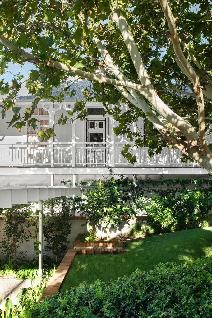
Whilst the classic facade was retained, reducing floor space to build a transformative open area in this Queenslander has brought the light home.
On the fringe of Brisbane’s CBD, a majestic Queenslander sits among tropical greenery in a leafy world of its own. Guarded by three towering trees – a jacaranda, a London plane and a fruit-bearing loquat – the newly renovated house belongs to Franki and Sean and their three young children. A special synergy between form and function seems to exist in the reimagined home, but it wasn’t always that way.
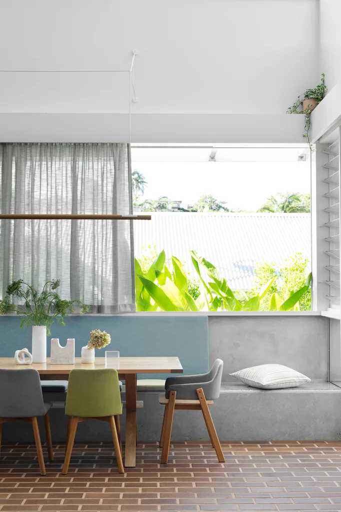
Relocating the eating area downstairs has connected it to the garden. The brick pavers on the floor are from Claypave. Otto dining table and Bay chairs from Jardan. Ceramic sculpture and white gloss vase, Jedda Clay. Tall white vase, The Borrowed Nursery. Glass sculpture, Trit House.
When the couple bought the pre-World War II home five years ago, it had already undergone other reincarnations, some less successful than others. “The house had been through various interventions and had been built in on the lower level with bedrooms,” says Sean. “It was pretty dark on that level and all of its materials and finishes were a bit dated-looking, with buttery creams, heritage greens and maroons. But we knew that the house had lots of potential.”
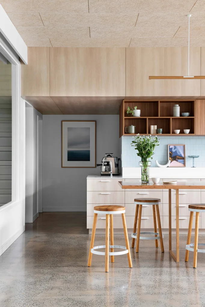
Wall lights, Artemide. For similar stools, try the Danny design at Matt Blatt. U-shaped vase, Borrowed Nursery. Ceramic plate and white cup, Reed Ceramics. Small artwork from Palette By Jono Fleming. Framed artwork (on wall) by Kara Rosenlund.
Enlisting the expertise of architect Matt Kennedy, who works out of Brisbane-based Arcke, the couple were intrigued by what initially presented as a radical proposal. “Arcke suggested sacrificing the upstairs living zone – where we had always spent most of our time – to make way for a double-height void in the new living space on the ground floor,” says Franki. “It’s something we would never have thought about doing, but it was definitely the right call. Matt’s insight was to open up the best part of the house to light, volume and breezes. In doing so, all the other areas of the home also benefit.”
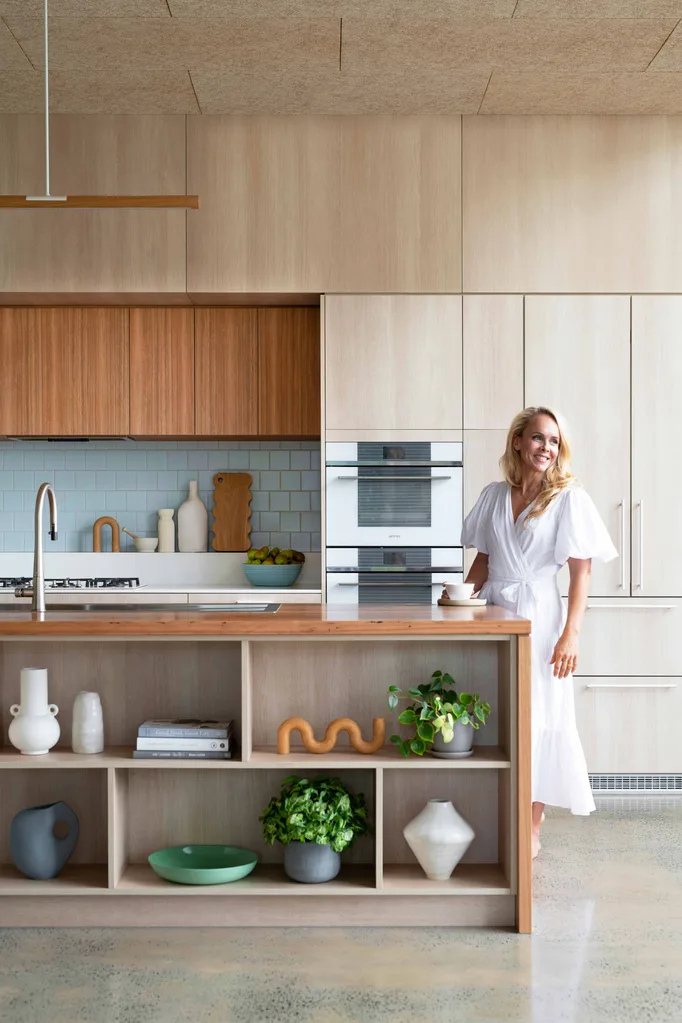
Acoustic ceiling panels by Troldtekt keep the sound level low in this family space presided over by Franki. The cabinetry is a mix of Navurban veneers in Ashwood and Auchenflower from New Age Veneers. Matching the recycled blackbutt benchtop are pendant lights by Alex Earl. Appliances, Smeg.
Matt says it’s not the first time he’s suggested such a radical solution. “In our practice, we take a considerable amount of time to ‘unstitch’ previous additions. We take a ‘less is more’ approach to building by removing previously built elements to improve the design, rather than adding on more spaces and further compounding the problem.”
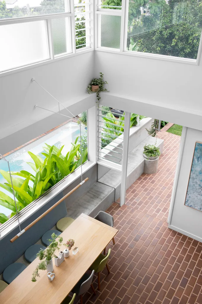
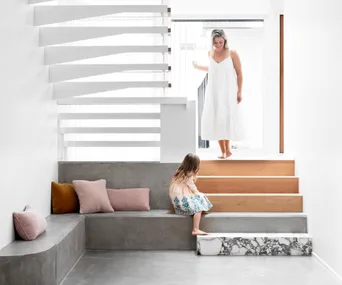
Removing part of the first floor created this lofty open space over the dining zone. The design extends outside via the built-in concrete seat, which is softened with flat padded cushions. Windows in this corner of the house allow plenty of natural light and glimpses of greenery to show through.
In this case, a great emphasis was also placed on making the home at one with the lush garden. “The kitchen previously occupied the upper level, which had a lovely view but no connection to the outdoors,” says Matt. “It was also positioned at a book-end of the house, so all roads led to the kitchen, creating a bit of chaos for the family. The lower level had two bedrooms and a bathroom that had been built in, creating another blockage to the outdoors. We’re very lucky that, here in southeast Queensland, there is really no other way to live than [being] open to the outdoors. Gardens and green spaces are known to reduce stress and increase well-being.”
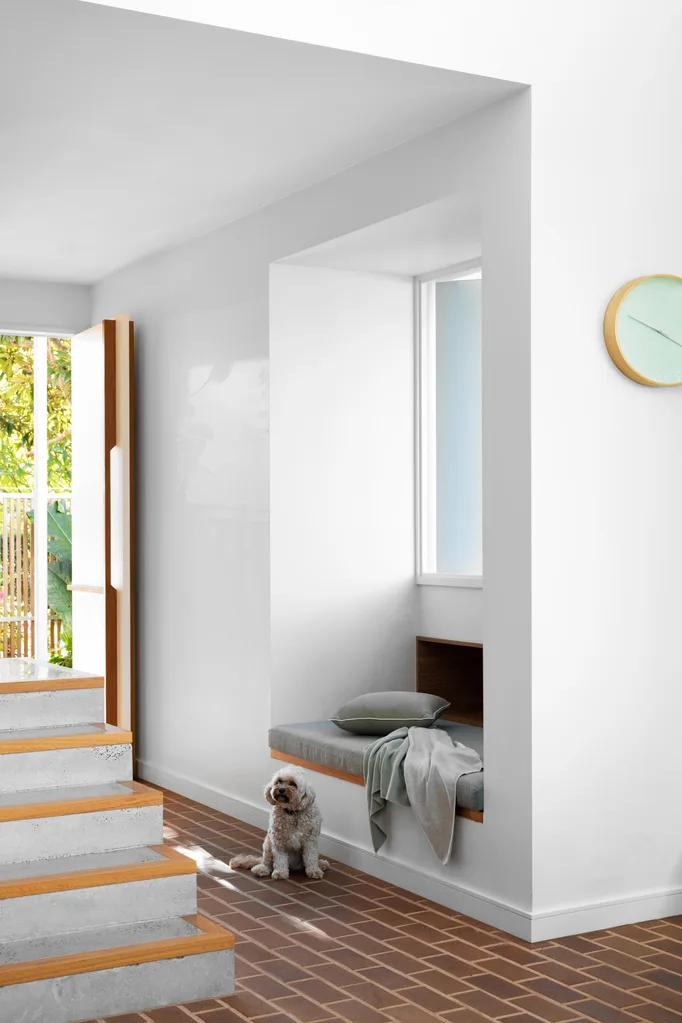
At the bottom of the stairs is a soft landing in the form of this upholstered day bed, a favourite with dog Bunny. Cushion and throw, Freedom.
During the year-long renovation, the family lived elsewhere while Arcke’s inspired vision was brought to life. Now a dramatic north-facing double-height void floods the kitchen, living and dining domain with natural light. The living area’s crisp white walls amplify the sense of openness, and a sun-drenched built-in day bed at the bottom of the stairs beckons as a cosseting corner of comfort. “The day bed is the most sought-after spot in the house,” says Arcke studio manager and partner Kate Kennedy. “The kitchen is flanked by the dining room on one side and a covered garden on the other, which gives you a sense of being enveloped by greenery.”
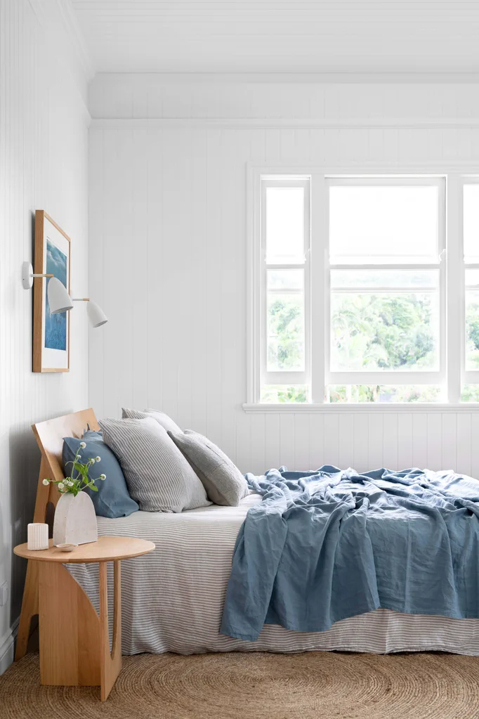
Wall-mounted lights by Nordlux sit on either side of The Wild Sea, a photograph by Kara Rosenlund. Linen, In Bed. Merhaba cushion, Clo Studios. Ethnicraft natural-oak geometric side table, Trit House. Ribbed vase, Reed Ceramics. Rug, Freedom.
Throughout the home, watery shades of blue further create harmony and tranquillity, with an organic material selection that incorporates brick and concrete floors, tactile timber-look veneered joinery and terrazzo tiles. “The mood is relaxed but glamorous,” says Kate. “We share a love of mid-century modern furniture with Franki and Sean, and found ways to incorporate some of their existing furniture into the scheme.”
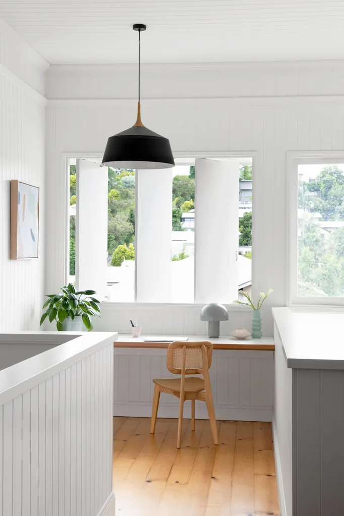
VJ wall panelling painted a custom white looks great with the refurbished Fiddes wax-finished pine floor. Cane chair, Trit House. Cosh table lamp, Freedom. Pink cup and vase, Jedda Clay. Mint vase, The Borrowed Nursery. Mez art print, Left Bank Art Group.
GOOD NEWS
To avoid mechanical cooling and facilitate cross breezes instead, architect Matt chose Breezway. operable louvres to manage the flow of air through the home. They appear on both levels of the exterior, seen here (above) from inside the study.
Extending directly from the dining room to the patio is a concrete bench seat, contributing to the impression of indoor-outdoor living. Meanwhile, the reworked upper level houses the family’s sleeping quarters and bathrooms, as well as an additional living area and study space. “This floor also benefits enormously from the void because areas such as the upstairs living room are filled with light,” says Matt, who took a broader design approach by prioritising natural light, cross ventilation and sustainability. To this end, he chose more eco-friendly limestone render over an acrylic one, a floor wax that is better from an emissions point of view, and LED lights with really low energy consumption.
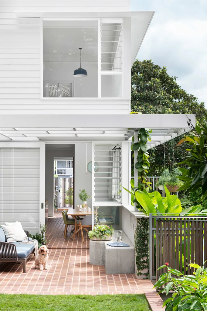
The rendered blockwork is Rockcote Lime Plaster colourmatched with Dulux Dune. A Tribù ‘Mood’ outdoor sofa from Cosh Living is good company for the concrete seat. Cushions, Clo Studios.
While things look brighter than ever inside, the big winner wasn’t floor space. “The footprint of the renovated house is actually slightly smaller than the house prior to the renovation,” explains Matt. “We think it demonstrates that better – not necessarily bigger – can be the best solution.”
The homeowners are in full agreement. “Our goal was to create a bright and breezy home for our family and friends,” says Franki, “and we definitely have that now.”
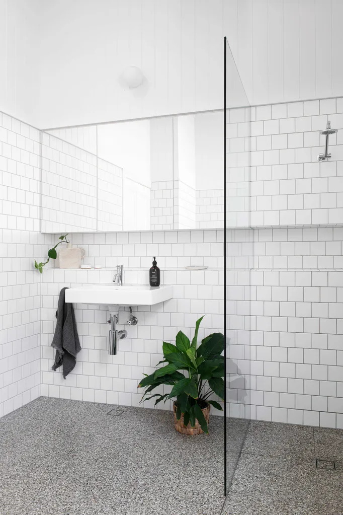
White tiles laid in a stretcher bond pattern keep the look clean. Basin, Caroma. Hand towel, Hale Mercantile Co.
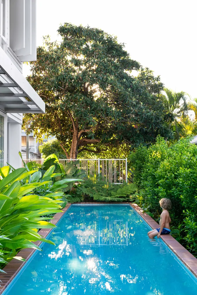
A rare moment when Leo has the water to himself. Pool coping, Claypave.
LESSONS LEARNT
“Create a home for all seasons,” says Sean. “Matt’s advice was to live in the house for four full seasons before we began talking about what we wanted. We’re so glad that we were patient and did experience all of them, as it was really important to see how we lived in the house throughout the year. It meant that we truly got to understand the site, its strengths and weaknesses, and could then capture the best of it.”

-scaled.jpg?resize=720%2C405) Mindi Cooke
Mindi Cooke
